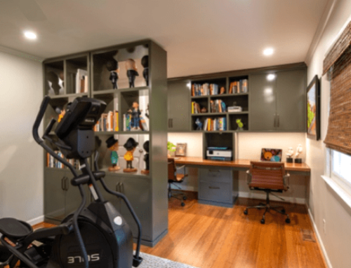
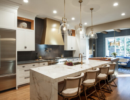
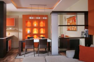
 We love color here at Marta Mitchell Interiors. I thought it would be fun to start a new blog series, focusing on a different hue and it's presence in a sequence of spaces. So here is the first of many posts, and to start us off, the color orange.
Frank Sinatra said, "Orange is the happiest color", and he is not alone in this thought. Its warm and inviting, yet it demands one's attention. Orange evokes excitement and stimulates the brain. The color has grown in popularity over the years. It was a popular pigment in interior design during the mid century era and gained momentum in the seventies. However Orange is back and one of it's shades, "Tangerine Tango" was named Pantone's Color of the Year in 2012. If you want to add some positive energy or just some fun eye candy to your home's interior, consider adding pops of orange.
Now, without further adieu, here are some interior spaces filled with orange.
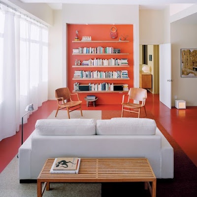
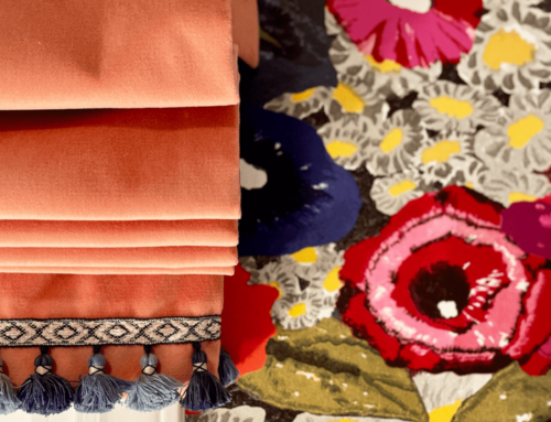
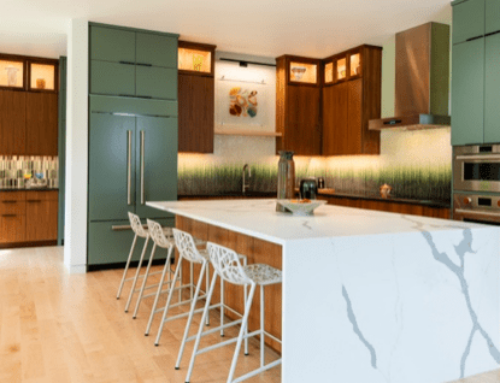
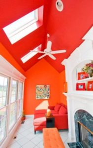
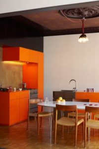
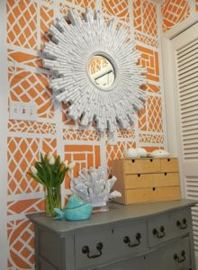
This over the top sitting area screams for your attention. There is a lot of white and natural light to help balance the overwhelming saturation that fills the wall and ceiling planes. And sometimes with bold color, one wall is enough. These spaces use orange in blocks, highlighting certain moments in the home. Orange also looks great in graphic statements such as wall paper, pillows, and art.
What do you think about this happy hue? Could you introduce pops of it into your home?

