Did you know that the color of your interior environment can determine your mood?
Believe it or not, this phenomenon is more important than being surrounded by your “favorite color”. Color psychology in interiors has been widely studied over the years. It provides many great solutions to an interior’s aesthetic, but it can also make you feel “oh, so good….”
Go Bold with Red
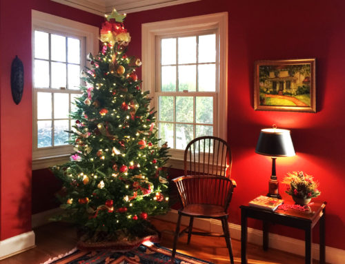
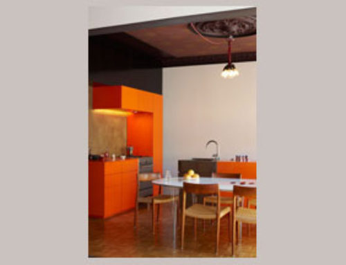
The color red is a stimulant. This color generates excitement and stimulation. It is a color of passion and energy. Red is one of three primary colors, making it a building block in many other hues. On its own, it makes a very bold statement. Although most choose to use the color in variations of its pure form by dulling it down a bit, any adaption of the color still carries some vigilance. This color has even been known to increase one’s blood pressure and heart beat. So tone down the shade in order to tone down its energy.
Another great quality of this bold color is that it grabs your attention and can be used to create focus points through out your space. While not everyone is brave enough to deck their walls in crimson, many are dramatic enough to flirt with the hue by using it in pops through out their environment. This still brings in the energy and stimulation while toning it down by mixing it in with other colors.


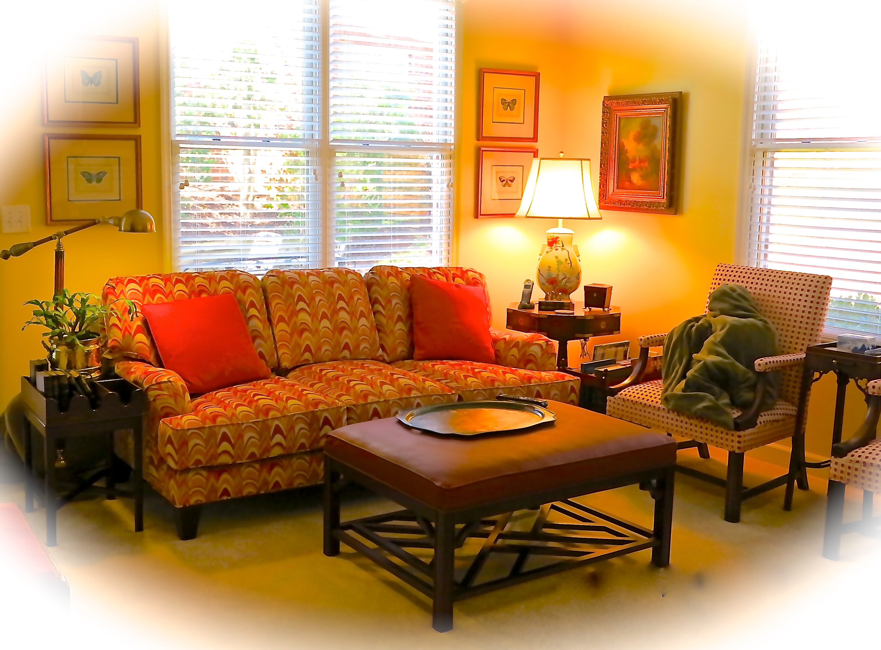
Be Happy with Yellow
Yellow is another stimulating color choice and can also be used to make a bold statement in an interior space. Most people think of yellow as the happiest of colors. It is full of optimism and enlightenment. This color can be used to spark communication, activate your memory, and even stimulate your nervous system, all of which might be causes for it making people so happy.
While the saturated color of yellow is a great bold and daring choice as seen in the images above, it is more commonly used in it’s subdued form when it comes to residential interiors. In this state, it makes a great back drop for other colors to be mixed in and takes the standard “neutral” to the next level.


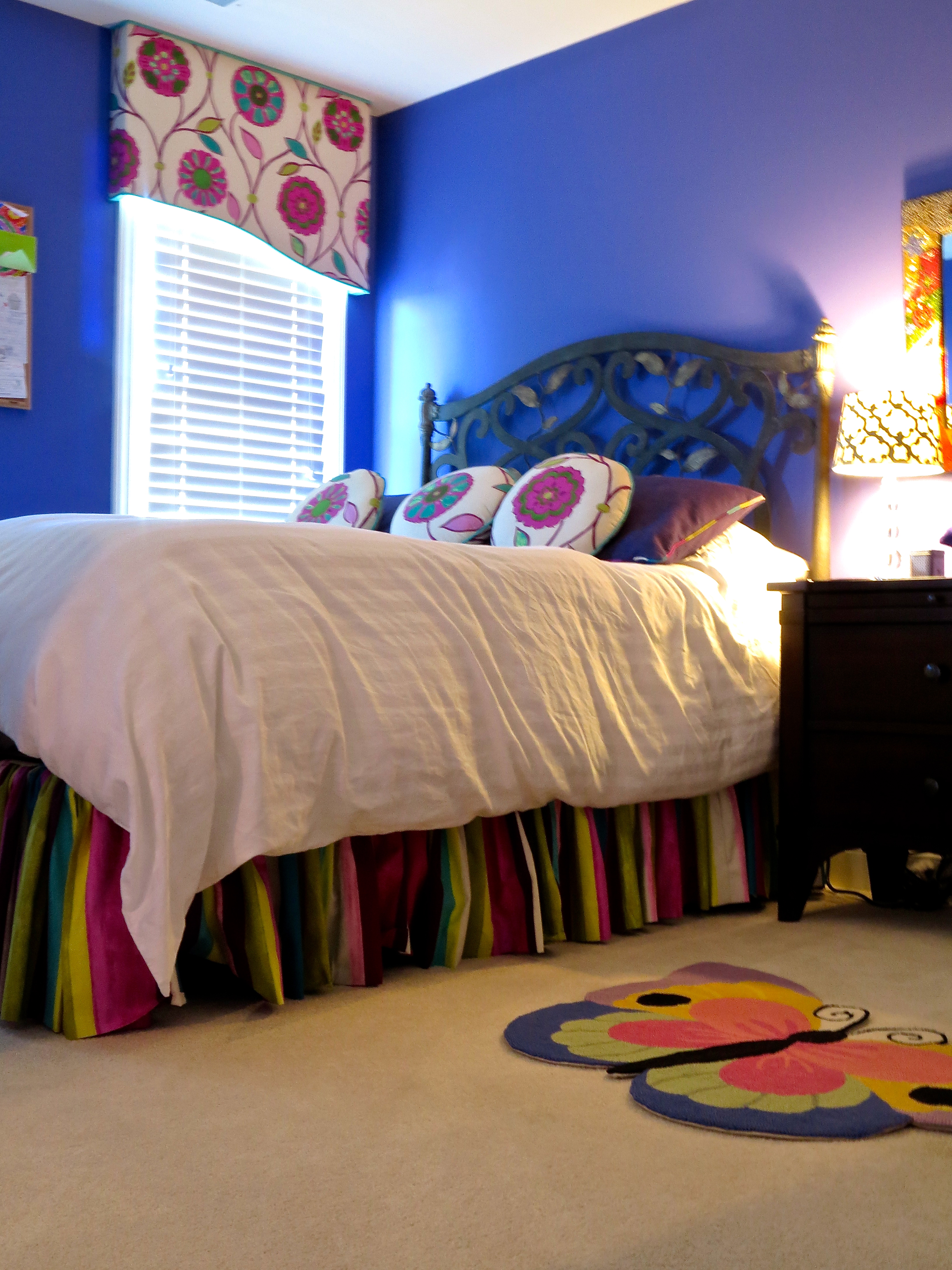
Relax with Blue
Blue is considered to be the most common answer when people were asked about their favorite color. And even while many associate the color blue with boys, it appeals equally to both genders and offers the least amount of controversy as a color selection for interior between the sexes.
This shade offers somewhat of a consistency to humans because it is such a big part of nature as seen in both the skies and the water. Blue exhumes trustworthiness and commitment. It gives off a calming and relaxing vibe which may be why so many choose this hue as their favorite.
The pictures below show how blue is incorporated into a space, whether it just be the color of a rug or the color of the walls. Blue is a great way to make the space feel more relaxing!


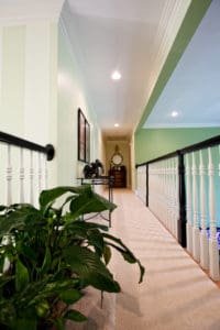
Calming Green
 Green has so many great variations it can be used in that will work beautifully in your interior.
Green is another calming color that, like the color blue, is seen as a constant because of its role in nature. It is a great mix of both cool and warm colors, bringing with it a sense of balance from the best of both worlds.
There are some hues from the green family that take on a negative vibe such as slimy and moldy shades, but most would not be considering those for their homes interior. Bringing in plant life is a great way to incorporate the calming and balancing affects of the color green.


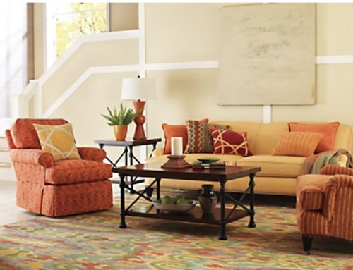
Pink Exudes Fun and Feminity
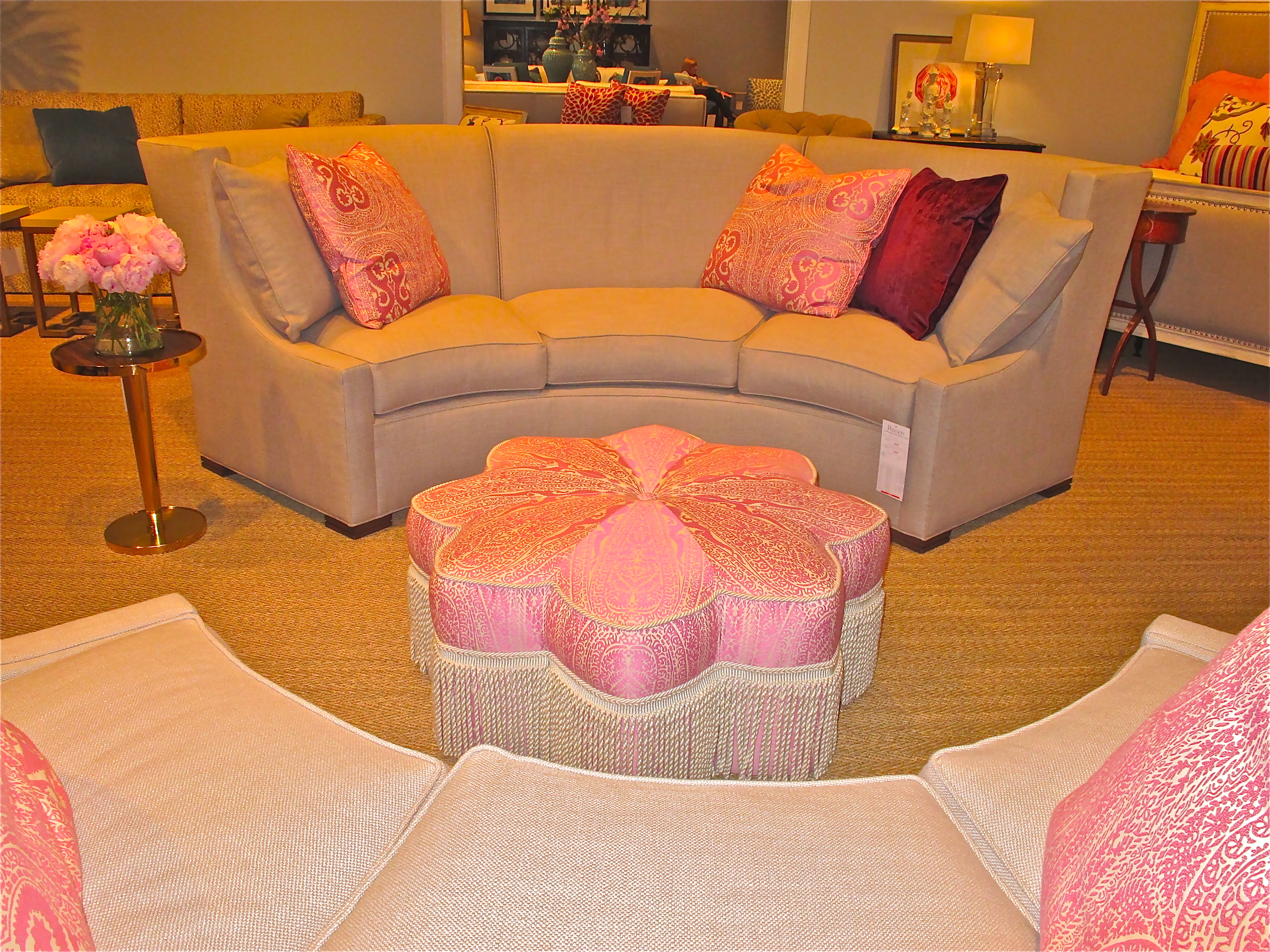
 Pink is viewed as youthful, fun, and feminine. It carries on many of the color red’s attributes because it is basically a toned down version of red. So you will still get some of the excitement and energy that the red embodies. As with any color, there are many different variations of pink.
Bright pinks are bolder and more stimulating to the eye while softer pinks can be very calming and romantic.
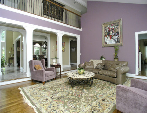
Balance tone with Purple
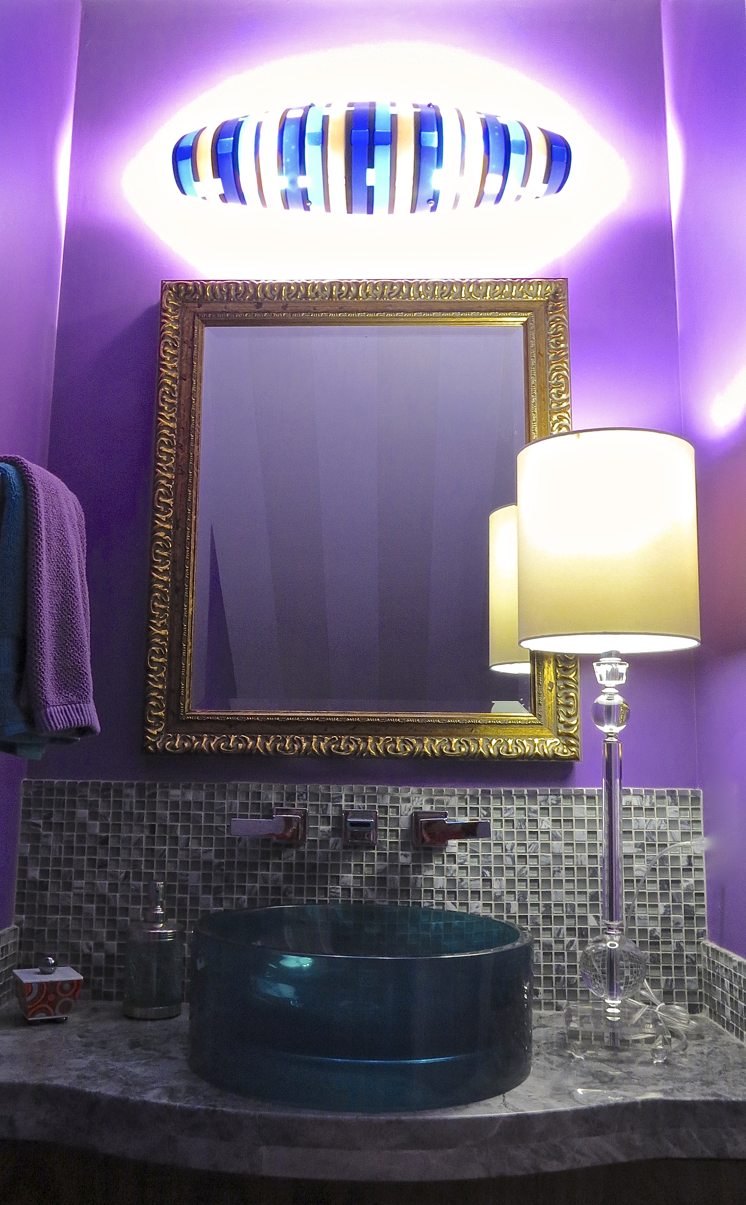
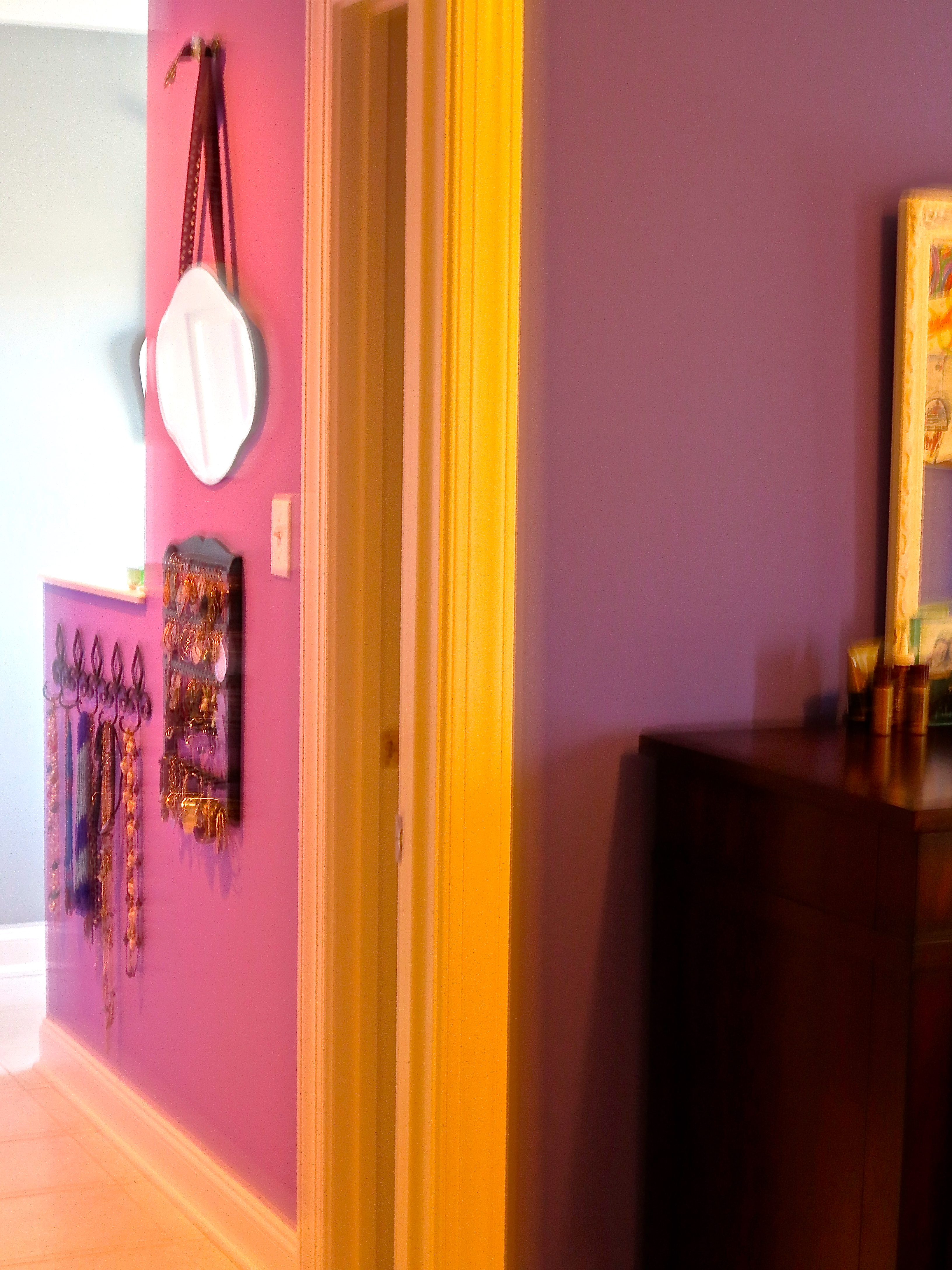
 Purple is also an offspring of red so it will also take with it some of the bolder, stimulating qualities. But like green it is a mix of a warm and cool and can create a sense of balance when used in the right tone. Many use purple to make a unique statement and it offers so many opportunities with its hues to do so. Purple can be calming, endorse creativity, and also uplifting.
Sources used for Research:
SensationalColor.com
CBS News’: “The Psychology of Design and Color”